Try it out. (It works best in Firefox with at least a 1000-pixel-wide screen.)
Screenshots
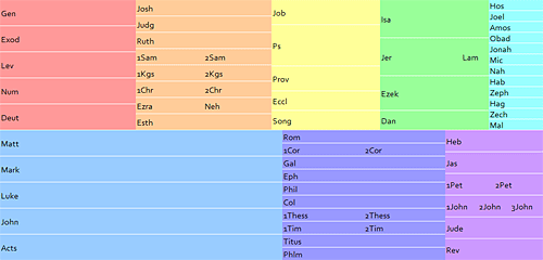
A half-size (non-interactive) image of the interface.

Hovering toward the left side of the Psalms shows you the title of Psalm 23.

Hovering toward the right of the Psalms shows you the title of Psalm 121.
Background
One challenge of developing a hierarchical Bible interface (going from books to chapters to verses) is the sheer number of options: 66 books = 1189 chapters = over 30,000 verses. Obviously you’re not going to show someone 30,000 (or even 1189) choices all at once; you need to prune the display somehow.
Often the approach taken by Bible interface designers is to divide the Bible into testaments (Old and New), then books, and finally chapters. This screenshot of the NET Bible iPhone application is typical of this approach:

Tapping either the “Old Testament” or “New Testament” option leads to a list of books in that Testament, which leads to a list of chapters in each book, which leads to the text of the chapter. (This image comes from the blog This Lamp, where Rick Mansfield has the enviable job of reviewing Bible iPhone applications.)
One limitation with this approach is that the design has to accommodate the wide range of chapter counts in the Bible—from single-chapter books to the 150 Psalms. This variety makes certain kinds of interfaces hard to use. The NET approach above scales pretty well, though I wouldn’t look forward to all the scrolling needed to reach Psalm 150.
There’s nothing inherently wrong with this approach, however, especially if you think hierarchically. But I’m always eager to explore alternative interfaces that simplify things for at least some people.
Before I get into the specifics, I want to acknowledge an Ajaxian article on the .Mac Web Gallery as the inspiration for this interface.
How It Works
My goals with this project were:
- Expose the book/chapter hierarchy in the Bible without creating a deep hierarchical interface.
- Provide more information than simply the chapter numbers for each book.
The result is a 1000×479-pixel grid. Books appear in color-coded columns based roughly on genre. Similar books (e.g., 1 and 2 Samuel) appear next to each other to minimize the vertical space required for the display.
The size of each book’s rectangle generally corresponds to the book’s length. The New Testament takes up about three times as much space as it should when compared with the Old Testament. A New Testament at the same scale as the Old would be too small to be workable. People tend to read the New Testament more than the Old, anyway, so it probably makes sense to enlarge it, though perhaps not as much as I’ve done here.
Behind the scenes, a script vertically divides each box into the number of chapters in the book. Genesis, for example, has fifty vertical slices, one for each of its fifty chapters. Hovering over one of these slices shows all the headings contained in that chapter. Moving to the left shows you the headings for the previous chapter, while moving to the right shows the headings for the next one. Clicking a slice takes you to that chapter in the ESV Bible.
This interface lets you discover a lot of information with minimal effort:
- The order of the books in the Bible.
- Genre groupings.
- The rough size of each book compared with other books.
- The number of chapters in each book.
- The subjects of each chapter.
- An overview of a book’s subjects if you flip through the book quickly.
- The text of the chapter if you click.
The Code
Concerning the code and markup, the page is valid XHTML 1.0 Strict, with a preponderance of ids as hooks for the Javascript but otherwise pretty clean. The Javascript is unobtrusive, so someone without Javascript can still get to the first chapter of each book. (A page with truly accessible fallbacks would place all the chapter headings in the HTML and use a script to hide them and then show them on demand, however.) All the chapter headings appear in the code; I figured AJAX calls would be too slow to give the instant feedback the application needs.
The application uses the base2 Javascript library to iron out some of the differences between browsers. I like this library because it doesn’t do things for you the way some frameworks do, but it removes a lot of the headaches for developing cross-browser applications (attachEvent vs. addEventListener, anyone?).
Limitations
It requires some precise mouse coordination to get to a specific chapter. It’s not great for people who have poor mouse control or who are using a low-quality mouse. It might make sense to expand the horizontal area allotted to each chapter.
There’s no reason the books have to be in a grid; it would work fine if they were sequential. You could then precisely allocate the width for each book based on the number of chapters it contains.
You could show more than just the headings in the chapter—you might show the first part of the chapter, pick out a few key verses, or even attempt to show the complete text of the chapter in the popup.
I’m not crazy about all the different colors. It’s not bad for demonstration purposes, but I’d probably choose a more-restrained palette in a production environment.
It probably doesn’t work right in Opera, Safari, and IE6 and below. It also won’t work on an iPhone since iPhones don’t send the necessary JavaScript events. It probably wouldn’t work that well as-is on an iPhone anyway; it requires too much precision. Indeed, the straight hierarchical interface model might be best for an iPhone.
The URL in the status bar doesn’t change when you hover over different chapters in the same book. It’s not a big deal, but it’s irksome.
Conclusion
I hope you find the interface useful (or at least intriguing) and that it inspires you to create a Bible-browsing interface of your own. Leave a comment and a link if you do—it’s always fun to see new ways of looking at the Bible. (Creating a mockup, a low-fidelity prototype, or even just a word picture is a great way to test ideas; you don’t need to develop a full-fledged application to show off your concept.) Comments on this application are of course welcome, too.
Wow, that rocks! I like how the chapter summaries show up on mouse over. That helps greatly when you can’t quite remember what chapter something happened/was said in.
Very good work.
Very nice! Power of Ajax, married with a “where in the Bible did I read that.” Good companion to search tools like biblegateway.com
I have just found your website. Found this site interesting. I used to use e-sword (but tend to just use internet searches now) which I like but did not like that the chapters were subdivisions of the books: open several books and the column is too long. I suspected that a chapter column should be separate with number of chapters altering automatically.
Your scheme may be a good path to pursue. I think that the length of the line needs to correspond to the number of chapters, and line widths should all be the same. Psalms are still difficult to navigate. It would mainly be used for lookup so other things like genre grouping are less important.
Then one could have title subdivisions as you do which you could mouse over to select a smaller passage than a chapter, or possibly have the text appear adjacent to that or in a separate text box.
Good work, enjoyed other blog entries too.
this is wonderful
I like the idea of a correlation between chapters of the books and size of square
This would rock for a chronological bible
thanks for sharing your concept
bt
i might use this in bible class
My Brother
thanks for taking the time and effort to share the results of your skills with others. This is awesome!